WCAG Compliance Standards Explained
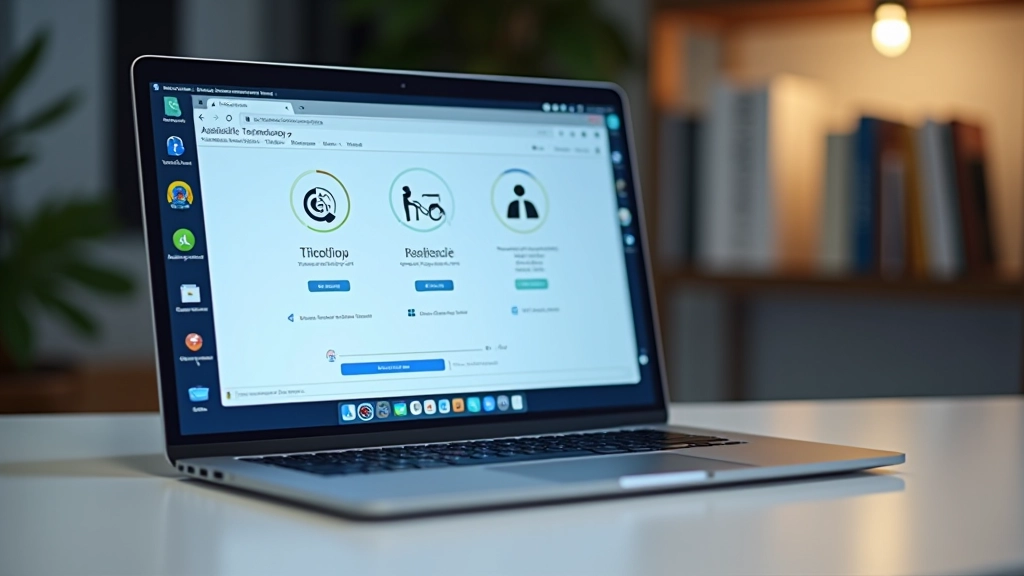
Break down WCAG 2.1 guidelines into actionable steps. Covers levels A, AA, and AAA with practical implementation strategies.
Read GuideColor contrast, text sizing, and responsive design adapted for Malaysian users. Practical tips that don’t require specialized knowledge to implement.

Malaysia’s digital landscape is growing fast. More people are getting online — different ages, different devices, different abilities. If your website doesn’t work for everyone, you’re leaving people out. That’s not just unfair, it’s bad business.
The good news? You don’t need to be a specialist to make your site accessible. The fundamentals are straightforward. We’re talking about proper contrast ratios, readable text sizes, keyboard navigation that actually works, and designs that adapt to any screen. These aren’t nice-to-haves anymore — they’re baseline expectations.
This guide breaks down what accessibility really means in the Malaysian context. We’ll cover the standards, show you what to actually do, and explain why it matters for your users and your bottom line.

These four principles form the foundation of WCAG 2.1 — the international standard that guides accessible design.
Users must be able to see or hear your content. That means sufficient color contrast (4.5:1 minimum for text), text that’s large enough to read, and descriptions for images. It’s about making sure information isn’t hidden or invisible.
People must be able to navigate your site without a mouse. Keyboard navigation, skip links, focus indicators that actually show where you are — these matter. Mobile users benefit too. If someone can navigate your site easily, everyone wins.
Content should be clear and straightforward. Plain language, consistent navigation, predictable behavior. People shouldn’t need to decode your site to figure out what’s happening. Simple beats clever every time.
Your code matters. Clean HTML, proper semantic markup, and compatibility with assistive technologies. When you build with standards, screen readers and other tools can actually interpret your content correctly.
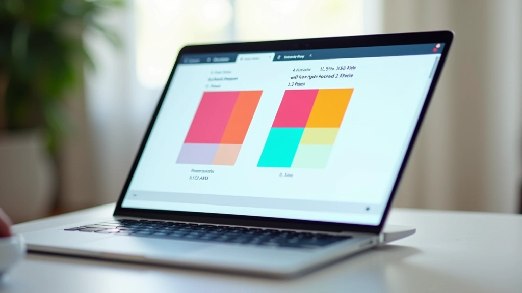
This is the easiest accessibility win and one of the most important. Poor contrast makes text hard to read — not just for people with color blindness or low vision, but for anyone viewing on a bright screen or with glare.
The standard? A 4.5:1 contrast ratio for normal text, 3:1 for large text (18pt or 14pt bold). That’s a measurable number. You can test it. Tools like WebAIM’s contrast checker take 30 seconds to use.
Here’s what it looks like in practice: black text (#000000) on white (#ffffff) gives you 21:1 contrast — way above the minimum. Dark gray (#333333) on light gray (#e8e8e8) fails at 3.1:1. See the difference? One’s readable, one strains your eyes.
Don’t assume. Test. Use actual tools. You’ll catch problems before your users do.
Size matters. The minimum recommended text size is 16px for body copy. Anything smaller gets uncomfortable fast — especially on mobile. Headlines should be proportionally larger and use a clear visual hierarchy.
But size isn’t everything. Line height (spacing between lines) affects readability just as much. 1.5x the font size is the sweet spot. So 16px text gets 24px line height. Dense text blocks with tight spacing? That’s asking people to work too hard.
Letter spacing matters too. A little extra breathing room makes text more scannable. And please, use actual fonts, not decorative scripts for body text. Save the fancy fonts for headings where people aren’t reading paragraphs.
In Malaysia, with our mix of devices and viewing conditions, generous typography isn’t a luxury — it’s practical.
Some users don’t use a mouse. Some can’t. Motor disabilities, older users, people just preferring efficiency — keyboard-only navigation is essential. The good news: if your HTML is semantic and built properly, it’s almost free.
When someone presses Tab, focus should move through interactive elements in a logical order — left to right, top to bottom. Not jumping around randomly. Use proper HTML elements (buttons, links, form inputs) and you’ll get this automatically.
When an element has focus, there should be a clear visual indicator. Not a faint outline. A solid, contrasting border or background change. Don’t remove browser focus styles unless you’re replacing them with something equally obvious.
A “Skip to main content” link at the top lets keyboard users jump past repetitive navigation. It’s hidden visually but appears when focused. Small detail, massive quality-of-life improvement.

In Malaysia, mobile is primary for many users. Responsive design isn’t just about looking good on different screens — it’s about your site being usable on any device. That’s accessibility.
Touch targets matter. Buttons and links should be at least 48×48 pixels. Smaller and people misclick constantly. Mobile users have fat fingers, not laser pointers. Make targets big enough to hit reliably.
Viewport scaling should work. Users should be able to zoom in if they need to. Don’t disable zoom with viewport meta tags. If someone needs magnification, they should get it.
Text shouldn’t require horizontal scrolling on mobile. Columns should stack, images should scale, and everything should reflow naturally. That’s responsive design done right.

You don’t need expensive software to test accessibility. These tools are free, take minutes to learn, and give you immediate feedback.
Paste two colors, get your contrast ratio instantly. It tells you if you pass WCAG AA or AAA standards. Takes 30 seconds. Use it before finalizing any color combination.
Install it, visit any website, see accessibility issues highlighted on the page. Missing alt text, poor contrast, structural problems — all visible at a glance. Great for learning what good and bad look like.
Open DevTools, run an audit, get an accessibility score plus specific recommendations. No installation needed. Free. Every developer should know this tool.
Try NVDA (Windows) or VoiceOver (Mac/iOS). Use your site with just audio. It’s humbling. You’ll immediately spot where descriptions are missing or structure is confusing.
Inclusive design isn’t a one-time project. It’s how you build from the start. Pick one thing this week — test your contrast ratios, audit your keyboard navigation, check your text sizes. Make it right. Then move to the next thing.
In Malaysia’s growing digital market, accessible design is competitive advantage. It’s the right thing to do AND it’s good business. Users appreciate sites that work for them. They return. They recommend them.
You’ve got the fundamentals now. The tools are free. The knowledge is out there. The only thing stopping you is getting started.
Explore deeper into specific accessibility topics and advanced techniques.
Explore More ResourcesThis guide provides educational information about web accessibility standards and inclusive design principles. Standards and requirements vary by jurisdiction, industry, and specific use case. While we’ve aimed for accuracy, accessibility requirements evolve regularly. Always consult the latest WCAG guidelines and relevant local regulations when implementing accessibility on your projects. Consider working with accessibility specialists for complex implementations.